
Ever scrolled through Facebook for hours despite having other things to do? Or went through a sign up process, clicking “Next”, “Ok”, “Get Started” buttons without reading anything else? Or maybe you’ve been using an app every day for years without knowing anything about its privacy policy? Don’t worry, there is a whole science created to make sure you don’t feel bad or even question this, it bears a name and it’s discussed publicly: dark patterns.
Dark design practices are very diverse in nature, but they all share a common attribute: nudging the users to accept, do, or share something they wouldn’t have if the information were presented to them in a non-ambiguous fashion. It’s essentially deception and dishonesty by design.
From deceptive wordings (such as “Don’t opt out” check-boxes) to shiny, colorful buttons opposed to boring legalese grayscale text on white background, the artifices are plenty. They involve an understanding of human psychology, such as harnessing FOMO to pressure us into making an impulsive decision or playing with timing and time pressure (the e-commerce’s beloved “Limited offer”).
A kind of magic?
Magicians use misdirection to draw their audience attention in order to screen from detection certain details for which secrecy is required. They attract the attention to one thing to distract it from another. Dark design patterns are used to achieve the same effect. Except that this time the goal of the trick is not to entertain you, but to harvest your data, manipulate your thinking processes or your votes, make you an app-addict, or just to make you buy things you do not need.
Magicians face their audience when they perform the deception; they have no trouble sleeping at night. They use their art to enchant. If they used it to steal, it would no longer be called magic but pickpocketing. Part of what allowed dark design patterns to spread is the disconnection with the audience: such practices are developed by UX designers who don’t have to look at their audience in the eyes. They merely see the conversion metrics grow and keep the grin to themselves.
A dark pattern typology
Dark patterns are nothing new. The UX designer Harry Brignull coined it eight years ago already and registered the website darkpatterns.org to call out the practice as unethical and help users recognize it as such. What’s new is the scale it reached, as we can now find dark patterns used in pretty much every major website or app. Harry Brignull even established a typology of dark patterns, all who are documented by countless examples. Here are some examples:
In-app dark patterns
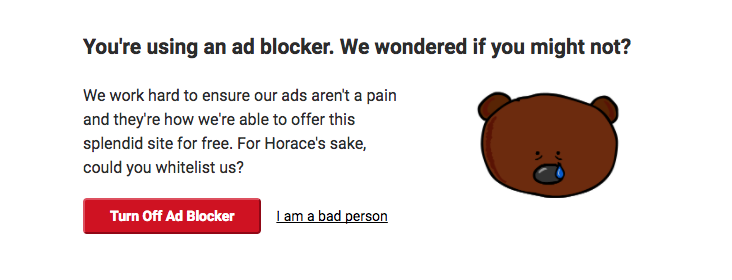
Confirmshaming: guilting the user into opting into something. The decline option is usually worded so that the user is shamed into compliance: who wants to click a I am a bad person action link?
Hidden costs: hiding additional costs (such as delivery) until the very last step of the purchase process. By then, the user has committed quite time to the process, and probably already inputted his credit card info. The confirmation bias might give him the nudge he needs to finish his purchase despite the surprise.
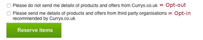
Trick questions: framing questions to mislead the users. While reading quickly, the user might think he’s opting-out while he’s actually opting-in. It works even better when used in series alternating opt-in and opt-out like on the example below:
Service-level dark patterns
The playbook is quite extensive yet not exhaustive; you can check out the other ones here. Besides the software and the apps themselves, dark patterns are found all thorough products and services, from the sign up to the account deletion process. Privacy policies and terms and conditions are the dark patterns magnets. Different methods are used to make them easy to accept, hard if not impossible to truly understand and even harder (if even possible) to refuse:
- Privacy-intrusive options enabled by default
- Obscuring the more privacy-friendly settings
- Threats of loss of functionality or deletion of the user account if specific settings are not chosen
- Pop-ups compelling users to make certain choices, while essential information is omitted or downplayed
- Inability to use the app or register if the privacy policy is refused (“take it or leave it” approach)
Dark patterns, beyond the apps
While dark patterns thrived and prospered on the Internet, they’re not bound to the digital world. Many subscriptions service adopt a “signing up is easy, canceling is hard” model. Once again, different tricks are used to make it as hard as possible for the user to unsubscribe, such as the threat of a high cancellation fee or making the unsubscribe process tedious. Some services even force the user to send a letter or call a given number while he registered by filling a form online. Those who work up the courage to call might face absurd business hours or agents that simply hang up on them.
Gym clubs are among the worst when it comes to canceling subscriptions. On boards and forums online, you can find countless stories of people going through the hassle of the cancellation process. This story from a redditor is particularly insightful: it took him 4 hours and 26 phone calls to cancel his gym membership, and the use of several different phone numbers.
How did we get there?
Considering the frustration and even anger they generate, one might wonder how dark patterns can be so prevalent? After all, stories like the one told above are detrimental to the brand. The deceived user will not fail to share his disappointment with his friends and online once he freed himself from the trickery. Well, the short answer is that superficially, dark patterns work. If you A/B test an honest, non-deceptive form versus a dark pattern filled one, the second one will certainly land more conversions.
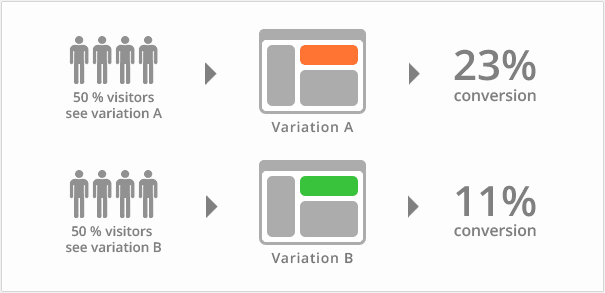 A basic form of A/B Testing
When only the perimeter of their implementation (sign up form, purchase process…) is considered, dark patterns inevitably land more results than an honest approach. The harmful consequences they can unleash are delayed and at the brand level. They only come later on when people are denouncing their practices online.
So, what’s the actual hidden cost of dark patterns?
Outside of a simple risk/benefit analysis at the scale of the brand, dark patterns behind widespread are now one of the main contributing factors of massive issues, at a societal level:
- Users are being hooked to apps: the dark patterns are engineered to encourage users to form addictive habits to the apps they interact with. These apps use diverse techniques such as abusive notifications (“We haven’t seen you in a while!”), or feeds implementing a variable schedule of rewards.
- Personal data are collected at an unprecedented pace and scale, and privacy is getting harder and harder to achieve. Free apps and social network harvest data and share them with a vast network of data brokers who profit from trading people’s personal information. In 2015, data brokering was already a $200 billion industry. This activity is lawful, but the users are mostly unaware of it or its extent thanks to misleading interfaces — this pattern bears the name of Facebook’s founder: Privacy Zuckering.
- The data collected makes it possible to target ads and communication so precisely that we reach a point where free will is put back into question.
The consequences of dark design and other privacy-intrusive practices are already there, and their effect will be felt for years to come.
How to reclaim our digital lives?
Individuals concerned about privacy are forced to work at well, an individual level so far. They look into the software they use and prefer open-source whenever it’s possible. They double check every piece of hardware they get and quite often have to disable several features (Wifi, Bluetooth…) to not compromise their privacy. To learn more about how to protect your privacy online, you can check the resources from the Electronic Frontier Foundation.
Alas, at a societal level the answers are lackluster if not inexistent. The laws are still very lax, and many of the patterns described before are still lawful. There were many talks about GDPR this year, but despite being more restrictive than previous regulations, it has many exemptions and is overall insufficient to protect individual consumers against privacy-intrusive companies like Google or Facebook.
So what are we left with? In situations where privacy is an absolute necessity, some tools are available, yet they have a steep learning curve as they do not share the friendly UX of their privacy-intrusive counterpart. Individuals who are unfamiliar with such solutions have no other option than going analog if they are not willing to train themselves.
Can tech fight tech’s abuses?
Since the laws won’t suffice to ensure individuals’ protection, some people are looking for solutions to trigger an ethical revolution in the tech space itself. It means that we’ll need not only new tools but a complete overall of the internet business models.
Regarding privacy and traceability of the data we share, the decentralized ledgers such as blockchain-based systems might provide a credible solution. They offer interesting features to regain control over our digital lives, such as censorship and attack resistance, or fault tolerance. Different projects are emerging to solve the several problems we currently face:
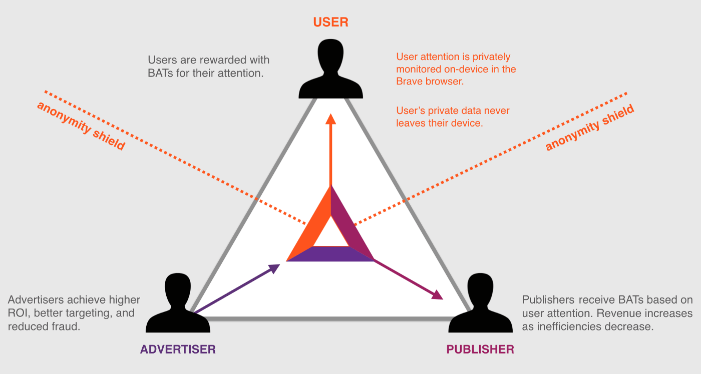
- Ethical advertising and privacy protection: Brave
- Reliable and decentralized identity management: Civic or uPort
- Financial privacy: Monero
Such systems are still under development and far from mainstream adoptions. In the meanwhile, the way we design digital interfaces needs to change: can there be such a thing as bright design? We can at least see how it would look like: transparent, honest, and empowering the users instead of deceiving them.